Widgets: the full guide
A widget is one card on a page: a number, a chart, a list, a table, a block of text, a goal, a record's fields. Dashboards, record pages and the other widget pages are all made of widgets. This page explains how a widget is built and who can see it. Each kind has its own section on its kind's page:
- Dashboard widgets: numbers, charts, lists and tables: Metric, Chart, List, Table, Text / Markdown and Goal.
- Record-page widgets: Record header, Field group, Child table, Form, Relationships, Files and Communications, and how a card shows only for contacts with a role.
- Work widgets: My work, Pipeline funnel, Timeline, Work item header, Checklist and Work-item comments.
- Scheduling widgets: Calendar, Schedule lanes, Agenda, Dispatch tray, Budget strip, Roster, Needs attention, Open shifts and Schedule requests, and what a Filter does to the ones fed by a view.
- Placing widgets on a page, layers and the grid: The Page Designer & Widget Library.
- How your own dashboard is put together and arranged: Your Dashboard.
Three places, three jobs
| Screen | What you do there | Who can open it |
|---|---|---|
Widget library (/admin/widget-library) | The list of reusable widgets in your space. + New widget and each widget's edit open the widget builder. | crm.widgets.read |
Widget builder (/admin/widget-builder) | Build or change one widget: its name, its data and how the data looks. It has no menu row; you reach it from the library or from + Place widget in the Page Designer. | crm.widgets.manage |
Page Designer (/admin/widget-designer) | Put widgets on a page, size them and decide who sees them. | crm.widgets.read to open; crm.widgets.manage to save at the Space or Group layer |
A library widget is a definition. A page places it. Change the widget in the builder and every page that places it shows the change on its next load.
The kinds of widget
When you build a widget, the builder shows every kind as a card, sorted into sections: Record, Data, Charts & metrics, Relations, Content, Work items and Contacts. The card says in one line what the kind shows.
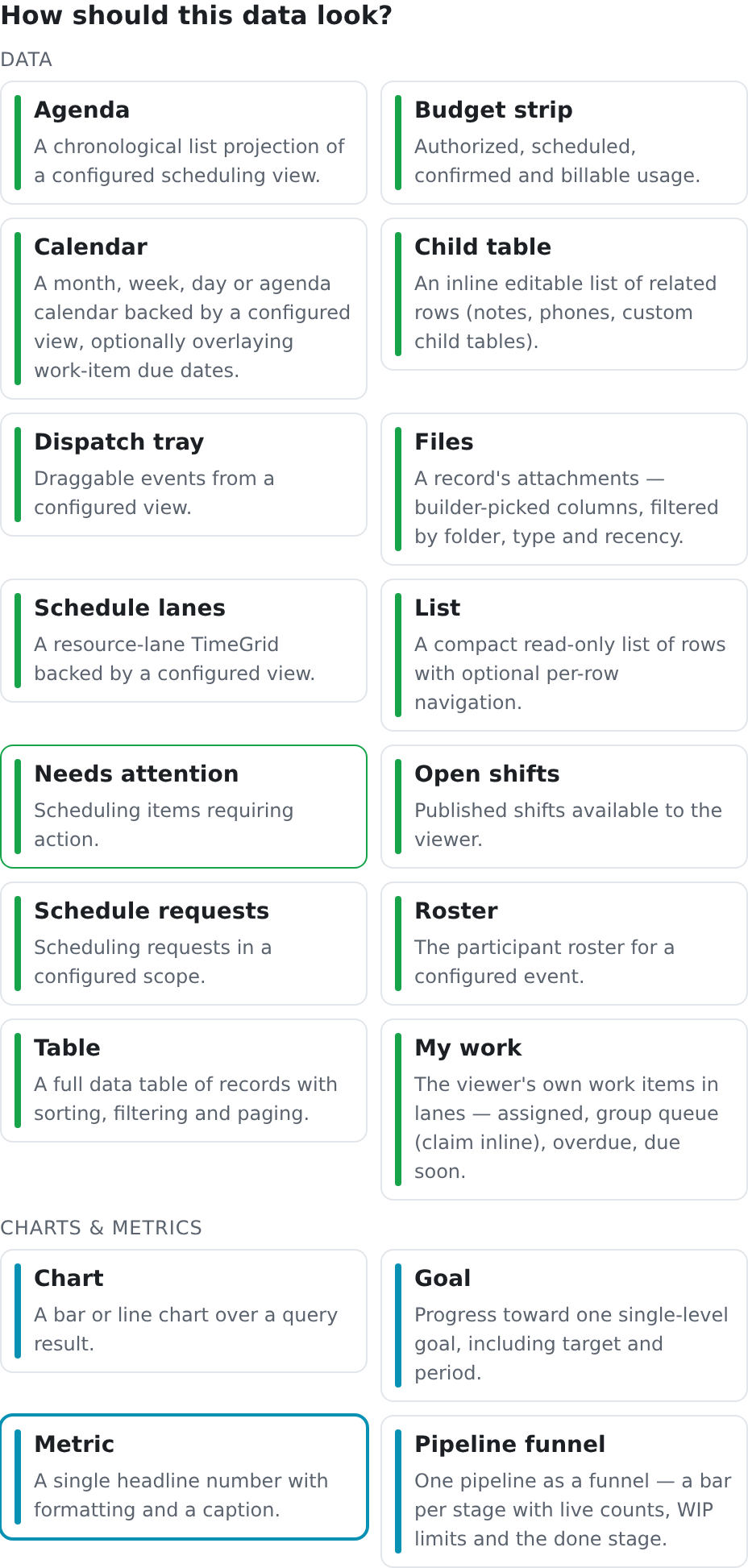
There are 28 kinds. A kind the system does not know (for example a widget saved by an older version) never breaks a page: its place shows a card titled Widget unavailable, and the rest of the page renders.
The widget builder
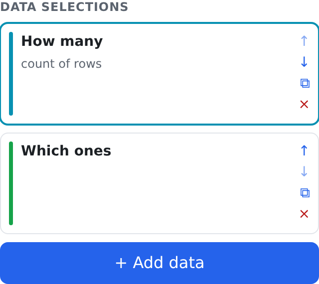
The builder makes every widget the same way: from one or more data selections. A data selection picks a kind, a source, which columns to show, display options and a filter. Most widgets have one data selection. A Custom widget has two or more, stacked in one card (see below).
At the top:
| Field | What it does |
|---|---|
| Name | The widget's title, shown on the card and in the library. |
| Key (technical name) | The widget's technical name. It is suggested from the name: lowercase letters, digits, _ and -. |
| Scope | This space saves the widget for your space. Global saves it for every space and needs system.scope.global_write. Without that permission the builder says so and saves for this space. |
| Enabled | A widget that is not enabled stays in the library, but no page shows it. |
On the left, Data selections lists the widget's data selections. Click one to edit it. ↑ and ↓ change the order, ⧉ duplicates one and × removes one. + Add data adds another. A widget can hold at most 8 data selections. Your administrator can change that limit with the widget_max_groups setting, and the button then says Group limit reached at the limit.
On the right is the selected data selection's editor, in this order:
- How should this data look? Pick the kind (the cards above).
- Where does the data come from? Pick a source. Which sources a kind can use depends on the kind:
- Record fields: the record the page is showing (record pages). - An extension table, with one row or many rows per record. - A view: a saved view of your records. This is the usual source for dashboard widgets. - Advanced: raw query key: a named query on the server (widget.…), typed in.
Some kinds bring their own data, such as Text / Markdown and Goal. For them the builder says "This kind brings its own data — no source to pick."
- Section label (optional — shown as a heading above this group): a small heading over this data selection on the card.
- Which columns show? (tables, field groups and child tables only). Choose one of three, on purpose: All columns, Only selected or All except selected. Until you choose, the builder says "No column choice yet — this group shows nothing until you pick one." With All except selected, columns added to the source later appear by themselves.
- Display options: the kind's own settings. Each kind's section on its page lists them.
- Filter: which rows to show. It can use any column of the source, also one you do not show. It is the same filter builder as on the lists, see Filters. It is offered only where the source gives rows. On a single record, fixed content or a card that fetches its own rows, there is nothing to filter, so the builder shows no Filter section. A Metric on a raw query key cannot be filtered: the number is counted in advance, and the builder says so.
Below them are Description (optional) and Advanced (JSON), which shows the whole widget as text, for settings the controls do not offer. Save writes the widget to the library. Cancel leaves without saving.
The builder never changes something silently:
- If some pages keep their own copy of this widget's settings, it names those pages above the editor. Your edit does not reach them.
- If you edit a global widget without
system.scope.global_write, it says first that saving makes a copy for this space. Pages that use the global widget keep it. - If the widget's data cannot be saved as it is (for example a filter on a column the source does not have), the save is refused and the builder marks the data selection that Needs attention.
The Custom widget
A Custom widget is a widget with two or more data selections. Each data selection has its own kind, source, options and filter, and the card shows them one above the other, each under its section label. For example, a number at the top and a list of the rows behind it:
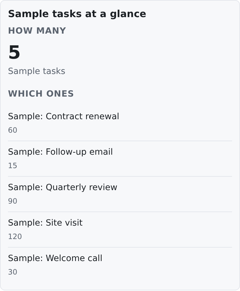
If you may not see the data of one data selection, that part is left out (a raw query key's part says which permission it needs instead) and the rest of the card still shows. If you may not see any of them, the card is not shown at all.
Who can see a widget
A widget only shows what you are allowed to see. A person sees a widget's data when all of these allow it:
- The page. Some pages need a permission to open them.
- The placement's Visibility. In the Page Designer a placement can require a role of the contact on the page, or permissions of the person looking. See The Page Designer & Widget Library.
- The source. A view is read with the view's own source permission:
crm.contacts.readfor a view of contacts,crm.work_items.readfor a view of work items. A raw query key is read with the permissions that query declares; the sample contact count declarescrm.contacts.read. - The kind's own door. For example, a Goal widget reads goals with
crm.work_items.read.
When the permission is missing, the widget is either left out or, for some cards, it shows its title and one sentence naming the permission it needs. It never shows a number or a list you may not see.
| To do this | You need |
|---|---|
| Open the Widget library and the Page Designer | crm.widgets.read |
| Build or change a library widget; place widgets at the Space or Group layer | crm.widgets.manage |
| Change a library widget's display options on one page only | crm.widgets.override (or crm.widgets.manage) |
| Build or change a Global widget | system.scope.global_write |
| Arrange your own dashboard | Being signed in (see Your Dashboard) |